


The first version of the current mobile console was created for Pandora FMS 4.1. Since then, a lot of improvements have been done on it. Specially to be adaptable to most kind of devices possible.
Hereby we made efforts to adapt the contain showed in the mobile console to all kind of aspect ratio and resolution screens.
For it, we designed a Responsive CSS with different layouts depends on the width of the screen to show more or less elements and change the elements size benefiting the space in bigger screens. The graphics and maps size are adapted to screen via ajax too.
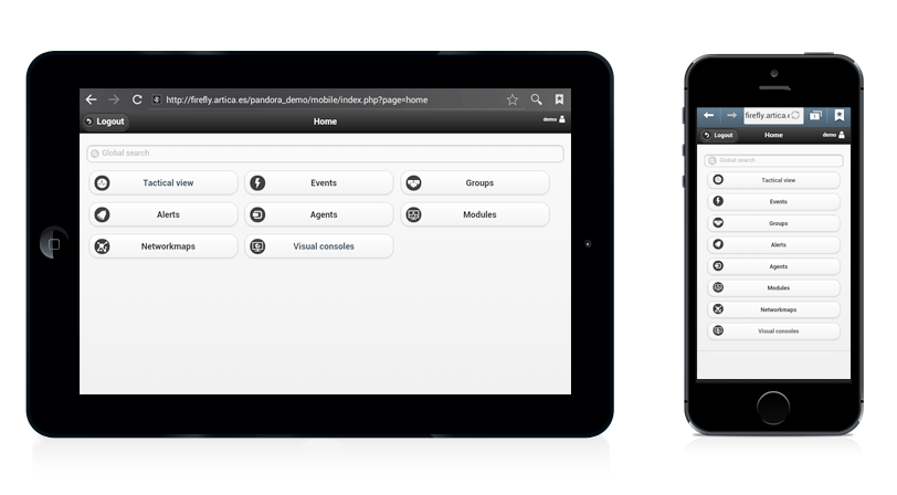
In this way, the appearance is adapted to small screens (smartphones), and bigger screens (tablets), even you change the orientation of your device between portrait and landscape.
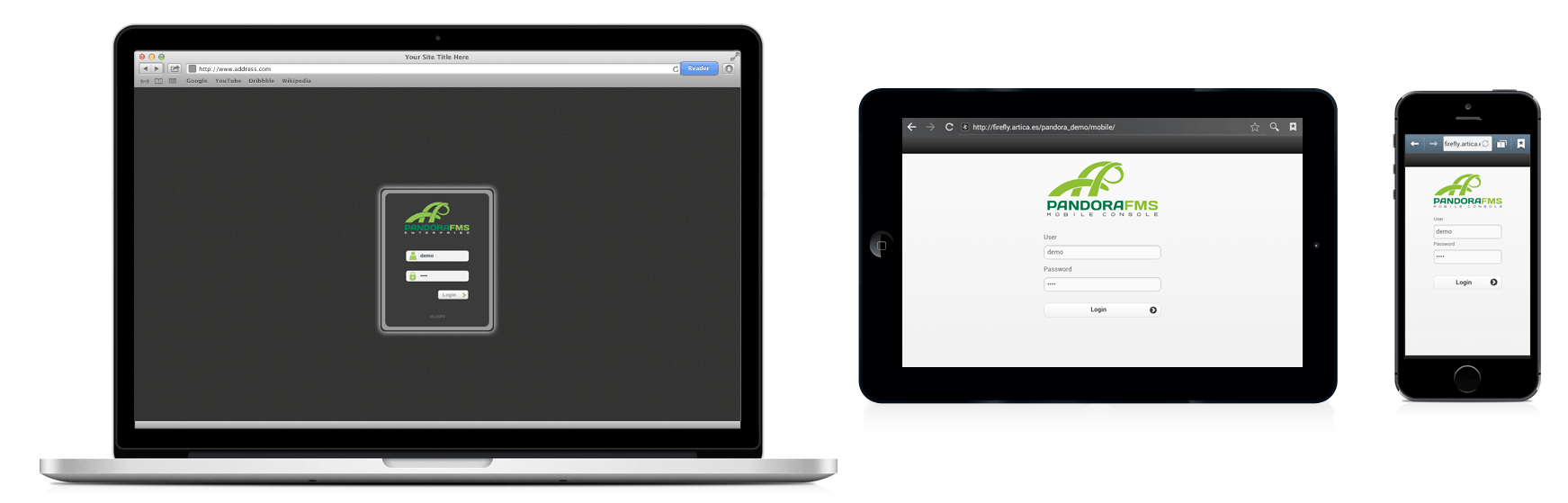
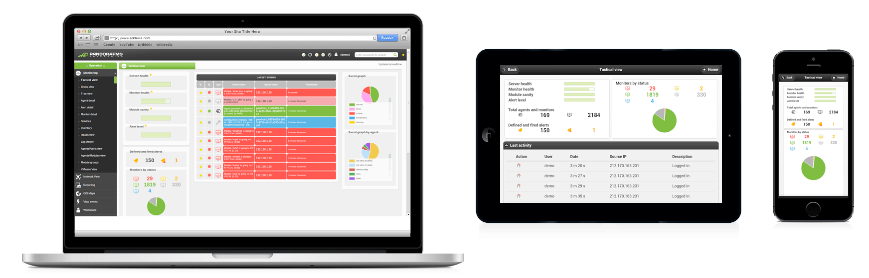
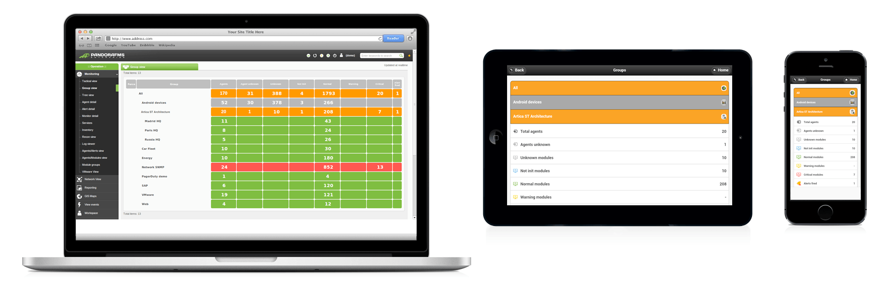
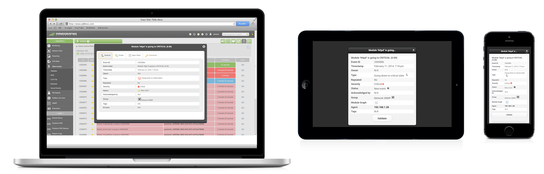
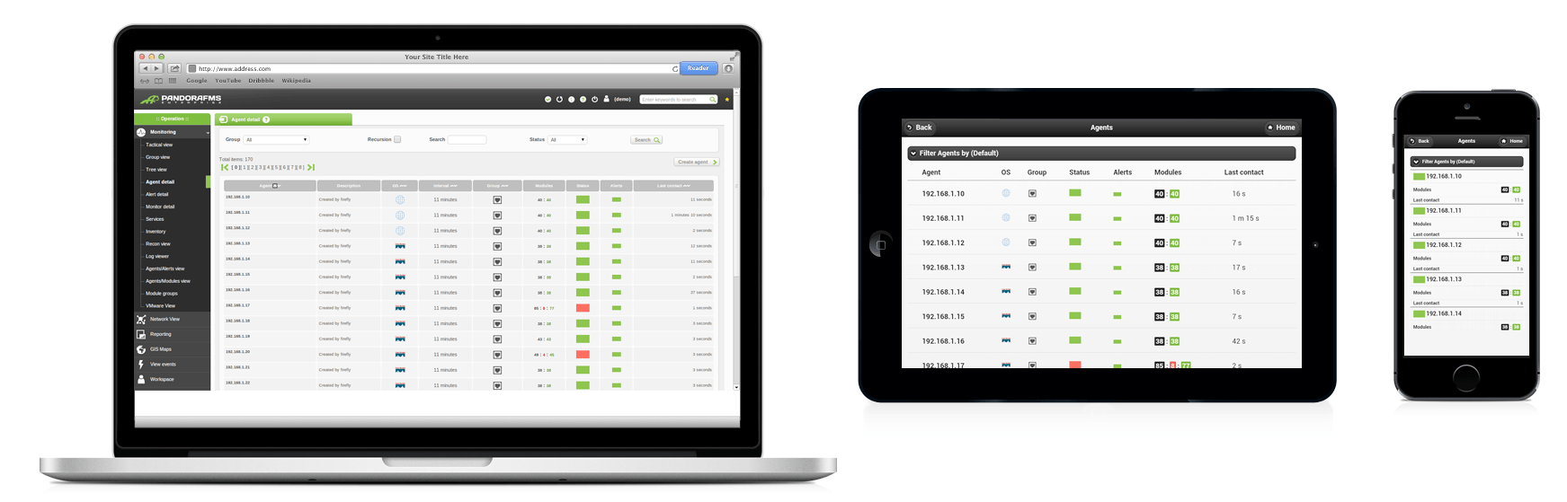
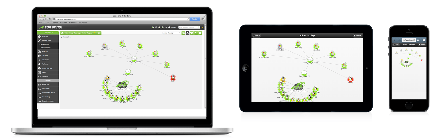
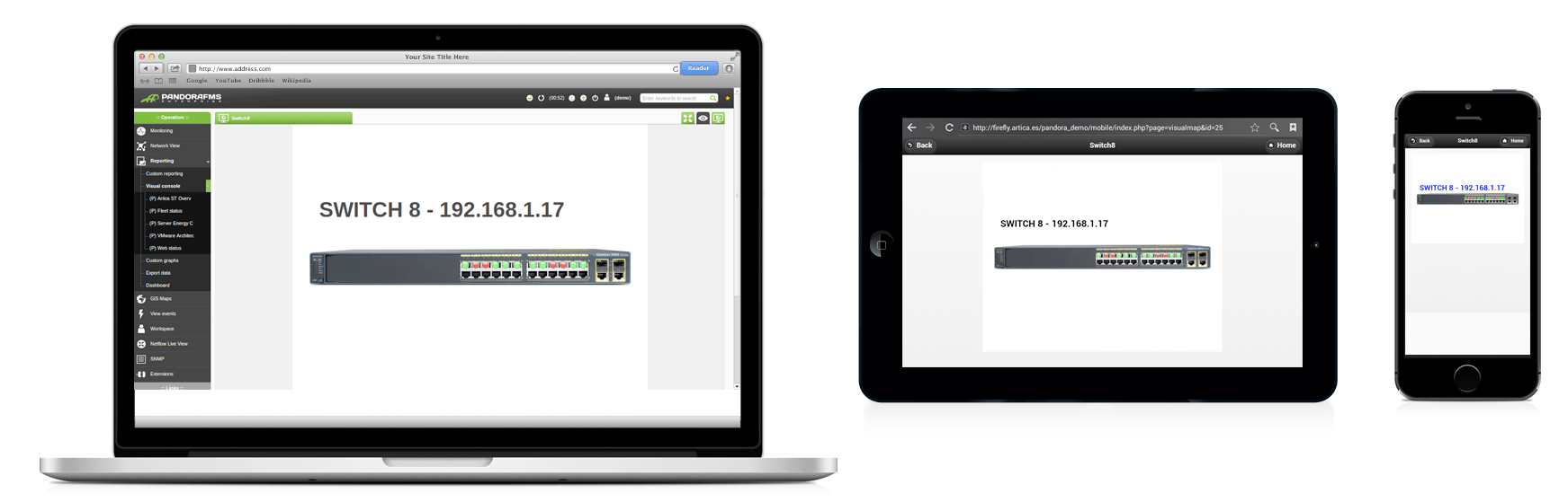
The following images show the same Pandora FMS section in standard web console (computer) and mobile devices (tablet devices and smartphones).


- Using the browser of our mobile device: Any mobile device browser (Any kind of smartphone or tablet with net connection). Only loading the path ‘/mobile’ from our Pandora FMS installation path.
For example: http://ourcompany.es/pandora_console/mobile
- Installing the Pandora FMS App for Android or iOS (Iphone/Ipad). You will configure the app with a Pandora FMS installation.
Pandora FMS’s editorial team is made up of a group of writers and IT professionals with one thing in common: their passion for computer system monitoring. Pandora FMS’s editorial team is made up of a group of writers and IT professionals with one thing in common: their passion for computer system monitoring.